Stats
Stats summarizes your archive for one time range: how much you worked with agents, which harnesses and models you used, what it would cost at API prices, and where the work landed. To see what changed between two periods, open the Changes tab, described in Compare periods.
- App
- Stats
- CLI
hansard stats
Use Stats in the app
Section titled “Use Stats in the app”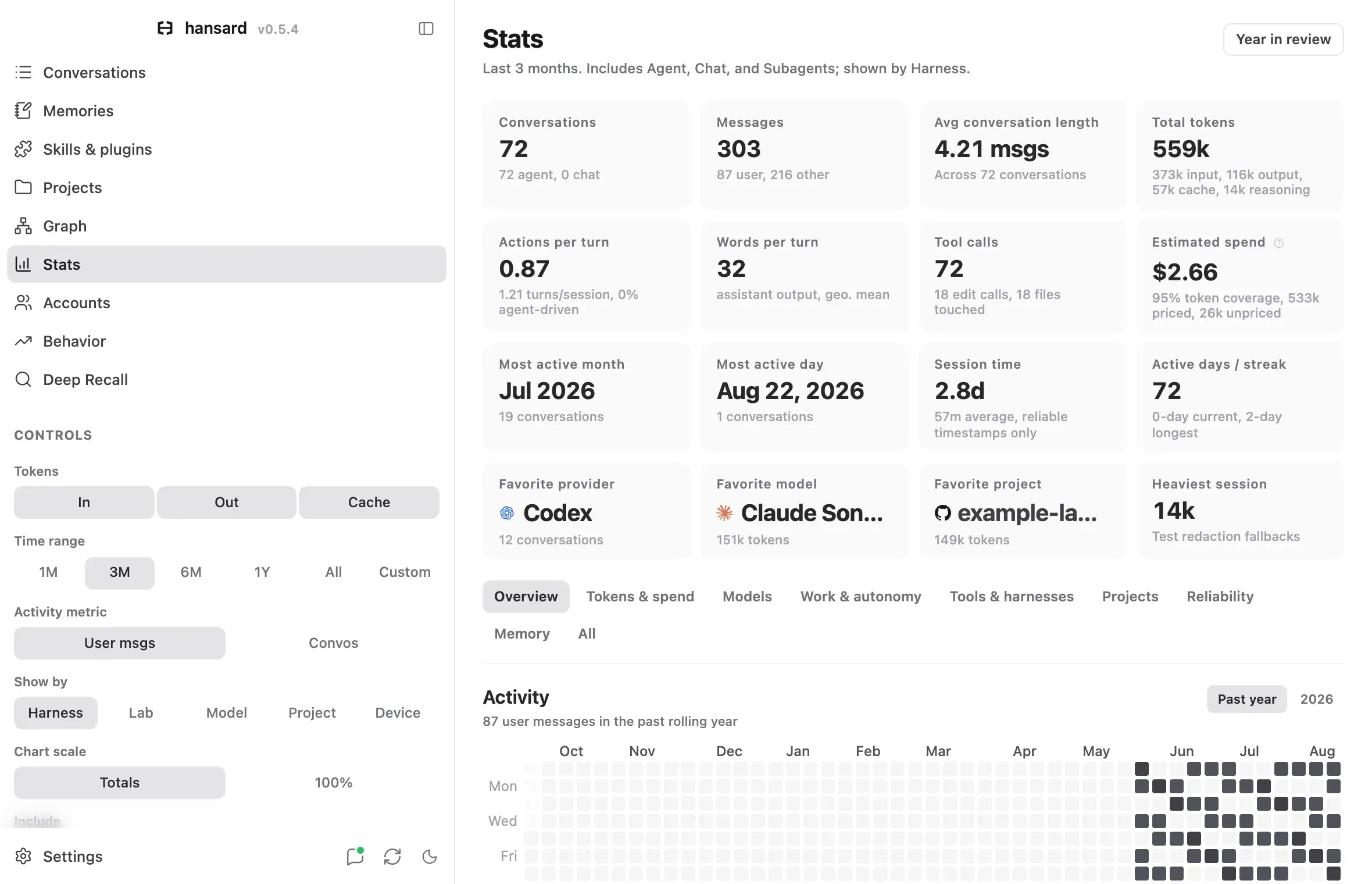
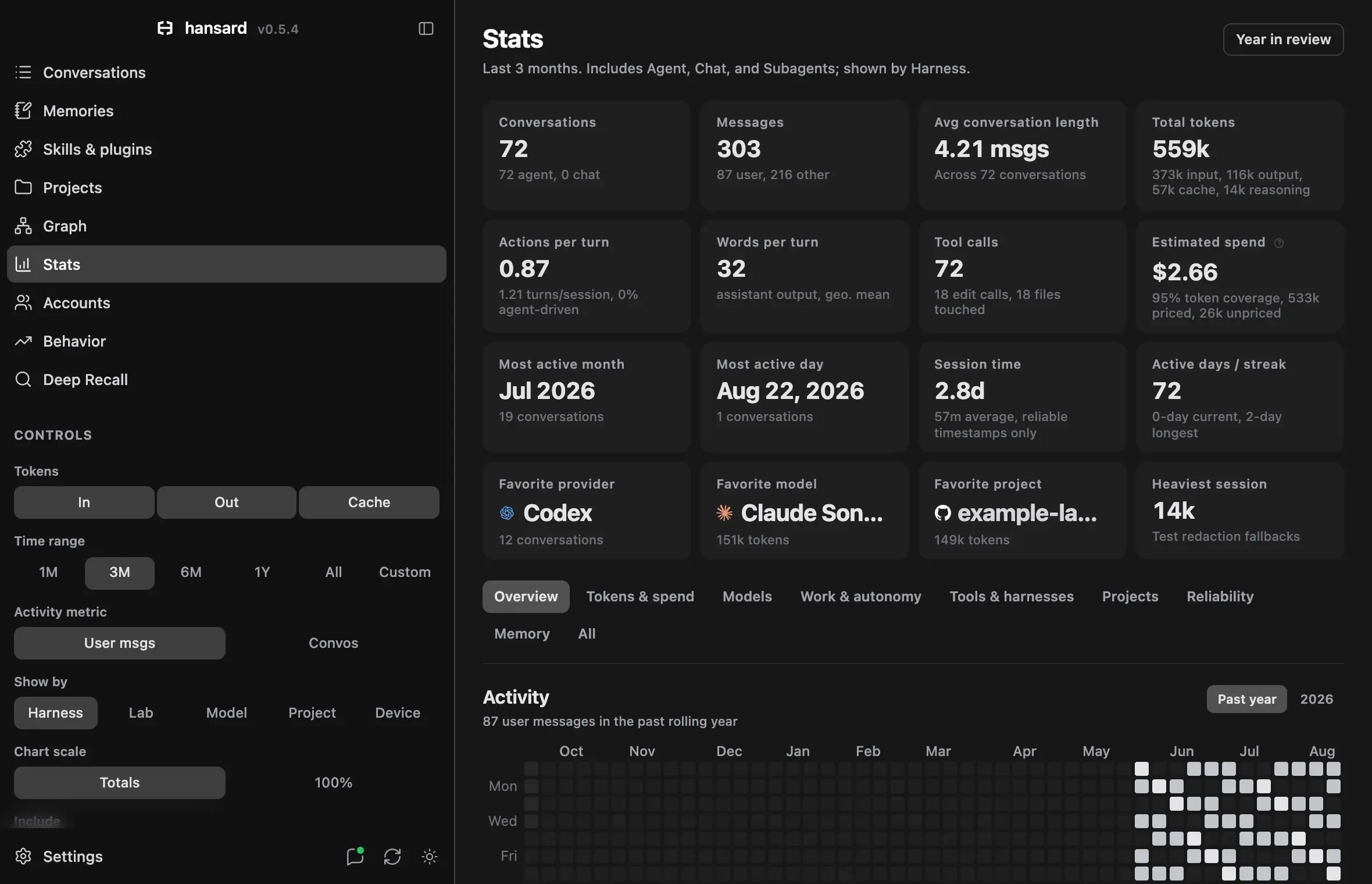
- Select Stats in the dock. The Controls panel appears in the sidebar, and the subtitle under the page title shows the current scope.
- Under Time range, choose 1M, 3M, 6M, 1Y, All, or Custom. Custom adds From and To date fields.
- Under Include, choose which kinds of sessions count: Agent, Chat, Subagents, and SDK jobs. Chat covers imported ChatGPT, Claude.ai, and Gemini conversations. The first three are on by default. SDK jobs is off.
- Under Show by, choose Provider, Lab, Model, Project, or Device to set how charts group the data.
- Open a tab: Overview, Changes, Tokens & spend, Models, Work & autonomy, Tools & harnesses, Projects, Reliability, Memory, or All.
- To see what a card counts and what it leaves out, select the i button next to its title.
The remaining controls refine what you see:
| Control | Options | Effect |
|---|---|---|
| Tokens | In, Out, Cache | Chooses which token directions count in token charts. |
| Activity metric | User msgs, Convos | User msgs counts prompts a person typed each day. Convos counts each included conversation once. |
| Chart scale | Totals, 100% | Totals shows actual values. 100% scales each stack to compare its composition; hover still shows actual values. |
| Filter | Provider, Lab, Device, Person | Lists the groups in your data. Clear a group to leave it out of every chart. Reset includes all groups again. |
The Where does activity happen? card on Overview shows one-shot SDK jobs when Include has SDK jobs selected, the same setting the headline totals follow.
Stats opens with the most recently calculated numbers and refreshes them in the background, so values can change a moment after the page loads. For numbers scoped to one project, see Projects and coordinators.
Use Stats from the CLI
Section titled “Use Stats from the CLI”hansard stats prints an overview, harness and model tables, classification
results when available, and tool, command, skill, MCP server, slash-command,
and file-reference rankings:
hansard statshansard stats --provider codex-cli --since 30dhansard stats --repo github.com/example/app --top 25To print only the tool, skill, MCP server, and command sections:
hansard stats --toolsTo get the complete result for a script or an agent:
hansard stats --json --top 100| Option | Effect |
|---|---|
--provider <provider-or-alias> |
Limits Stats to one harness or source. Accepts the same names as hansard history. |
--since 30d|90d|all |
Limits Stats to a date window. Without it, Stats covers the whole archive. |
--repo <repo-key> |
Limits Stats to one project, such as github.com/example/app. |
--top N |
Sets rows per table (default 12). With --json, also caps the tool, skill, MCP server, and command lists. |
--include-sdk-jobs |
Adds one-shot SDK jobs to token, spend, and tool totals. Conversation and activity measures still leave them out. |
--tools |
Prints only the tool, skill, MCP server, and command sections. |
--json |
Prints the full Stats data, including model identities and pricing versions. |
Read the headline cards
Section titled “Read the headline cards”The twenty cards above the tabs summarize the selected time range under the current Include and Filter choices, the same scope the subtitle under the page title names. They sit in rows of four: how much, what it cost, what the agents did, when, and who and where.
| Card | What it shows |
|---|---|
| Conversations | Included conversations, split into agent, chat, and subagent, plus the one-shot SDK jobs kept separate or included. |
| Messages | Messages of every role, with the share a person typed. |
| User messages | Prompts a person typed, with the average per active day. |
| Avg conversation length | Messages per conversation, with the prompts typed per agent or chat conversation. |
| Tokens | Tokens used as each provider reports them, with the output share named; the rest is input and cache. |
| Estimated spend | API-price estimate for the tokens used, with the share of tokens Hansard could price. The i button explains the estimate and links to the pricing details. |
| Spend per message | Estimated spend divided by the prompts a person typed, so each prompt carries the agent work it set off. |
| Heaviest session | The conversation with the most tokens that started in the range. Its title opens it. |
| Tool calls | Tool calls, with edit calls. |
| Tool calls per turn | Tool calls per typed prompt in a typical agent conversation (a geometric mean over conversations, so it sits below all tool calls divided by all prompts), with the share of agent-driven conversations, those above 16 calls per turn. The i button explains the rate. |
| Words per turn | Words of agent reply per typed prompt in a typical agent conversation, the same geometric mean. |
| Session time | Total session length and the average per conversation, counting only sessions with reliable start and end times. |
| Active days | Days with activity, with the longest and current run of consecutive days in the range. |
| Most active month and Most active day | The month and the local calendar day with the most typed prompts. |
| Busiest hour | The local hour with the most typed prompts, and its share. While more than half of the range’s prompts have no recorded time, it names no hour and says how many wait for hansard rebuild --since all. |
| Favorite provider and Favorite project | The provider and the project that received the most typed prompts, and their share. Projects carry their GitHub or folder mark. |
| Favorite model | The model with the most tokens in the range, and its share of them. |
| Projects | Projects with activity in the range, split into GitHub repositories and other folders. |
Estimated spend is what the recorded tokens would cost at published API prices. It is not your subscription bill. To track plan limits, see Accounts and plan usage.
What each tab shows
Section titled “What each tab shows”| Tab | Sections |
|---|---|
| Overview | Activity calendars (combined, plus separate agent, subagent, chat, and SDK batch job calendars), Conversation shape, the Provider mix (or the grouping chosen under Show by): how the mix shifted between the halves of the range (groups with at least 1% of either half’s tokens) and how each group trended week by week (groups with at least 1% of the range’s tokens), with the rest under Show, a leader timeline of which group received the most of your messages each week or month, and Session rhythm: the local hour of the day and the hour of the week when you send messages, when your days usually start and end, and session time per week or month. |
| Changes | The selected range against the equally long period before it: totals, a running total by day, which groups gained ground, how your hours shifted, tool, command, and skill shares, what was new or went quiet, working rates, and work modes and outcomes. See Compare periods. |
| Tokens & spend | Token usage: Where do tokens and spend go?, a ranked table by the Show by grouping that sets each row’s share of tokens beside its share of estimated spend, a leader timeline of which group used the most tokens, or cost the most, each week or month, and How did the token mix change? by token kind; Estimated spend: Which models cost the most? with spend per conversation, spend per day, per week or month, and per prompt you typed, and the models whose spend share differs from their token share; Daily totals; Output token work. The token kind and output charts stack week by week on ranges up to about six months and name each kind beside the last column. |
| Models | Your top models ranked by conversations, tokens, or spend; Model settings, one row per model with its reasoning effort mix and speed where recorded; and Model family insights. One lab selection scopes both Model settings and Model family insights. |
| Work & autonomy | Activity & autonomy, which ranks models on tool calls per human turn or on the rate column the table is sorted by, as bars from zero that take their autonomy band’s color on tool calls per turn, with rows under 10 rated conversations faded; and How the work turns out: work modes and outcomes, the leading kind of work and model each month, model success against spend, spend by kind of work, and evidence. |
| Tools & harnesses | Harnesses: Which harnesses do you use? over time, Which harness did most of your work each month?, How does each harness work?, a sortable comparison, Which harnesses cost the most?, and What do their tool calls do? by kind; Harness versions: How did versions roll out? and Did outcomes change with versions?, with every version’s figures under Show version details; and Toolbelt: Which tools do they reach for?, the most used tools, shell commands, skills, MCP servers, slash commands, and @ references. |
| Projects | Where your attention went: when each project was active, which project received the most human messages each week or month, the projects with the most human messages, and when projects had their first archived session; What each project costs: which projects cost the most, which cost the most each week or month, and which cost the most per human message against the median; What each project produced: file edits, commits, and judged outcomes. |
| Reliability | API errors over time, per 1,000 requests, by kind, by hour or weekday, and how much Claude Code work ran into them; Tool reliability by harness, by project, by tool, and over time; Subagent delegation fan-out and growth; Codex guardrails; and Cloud agent outcomes. |
| Memory | Memory footprint (archive growth, memory by provider, and project against global memory), Memory activity (reads, writes, and loads per month in one chart, idle months included), Memory age & staleness, and Memory churn for the memory archive. |
| All | Every section in one scroll, in tab order, with each tab’s sections under its own heading. |
What time of day do you work? and When in the week do you work? count
each typed prompt at the local hour it was sent, on this device’s clock, and
follow the activity metric. Hover a weekday’s share in the week chart for its
average per day. When does your day start and end? counts the days whose
first and last message fell in each hour, with each day running from the
quietest hour of the range so a late night stays with the day it continues; its
takeaway names the most common start and end hour, the two bars drawn darker.
Conversations archived before prompt times were recorded spread their messages
evenly over the hours between their start and end, or keep them at the start
hour when a conversation ran longer than twelve hours. In the time-of-day bars
those messages draw in a lighter tint and the note under the chart says how
many; the day chart draws lighter the days whose first or last hour holds only
such messages. The week chart’s color carries each cell’s count, so no cell is
partly tinted: while those messages are more than half of the range every cell
draws lighter, and otherwise a dot marks each cell holding mostly such messages.
While they are more than half of the range, no chart names a busiest hour, slot,
or usual start and end, because one long conversation would decide it.
hansard rebuild --since all records the time of each prompt without a
reimport. The count of days in When does your day start and end? follows its
own day boundary, so it can differ from the Active days tile, which counts
calendar dates. How much session time each week? reads week by week, with
weeks starting on Monday, on ranges up to about six months, and month by month
on longer ones.
With Show by set to Project, the Overview leader timeline groups home, temporary, scratch, and harness catch-all folders into one entry that never leads, as on the Projects tab, and names the chat messages that belong to no project in its takeaway and in each week’s tooltip. The mix shift compares the two halves of the days with token activity in the range, and its takeaway and tooltips name each half’s dates, so Show by Provider and Show by Project can compare different halves when chats carry tokens before any project does. The takeaway names the group whose share moved most, including groups folded under Show, and says when one half holds a sliver of the other half’s tokens.
The section tabs stay pinned at the top while the page scrolls.
What does one prompt cost? divides estimated spend by the prompts you typed, for the five largest groups under Show by, week by week for ranges up to about six months and month by month for longer ones. Subagent and delegated SDK work adds spend without adding prompts, so a prompt carries the cost of the work it set off. A point needs at least 5 prompts and 80% priced tokens, and the scale is logarithmic. Each line ends in its color, mark, and average over the range, a group with a single point shows its value beside its dot, and the time axis starts at the first week or month with enough priced prompts. When most groups have fewer than three such weeks or months, the chart ranks their averages over the range instead of drawing lines.
Under Model family insights, How do releases compare? lists each dated model in release order with its value; dot size shows sessions. A lab with no models for the chosen metric, such as one whose models fold reasoning into output, opens on the first metric it has data for, and the subtitle says so. On phone widths the section’s charts name models without the family word their mark already shows, such as Opus 4.6 for Claude Opus 4.6. Which model did most of your work each month? gives each model that produced the most output tokens in at least one month its own row, fills the months it led, and traces the months it was in use without leading; bars above show each month’s output on a log scale, and months without output keep their place. Models in use that never led open under Show, shaded by their share of each month. When did you pick up each model? marks each model’s official release date with a diamond and its first and last archived use with a thin line, with a bar for the sessions started each week or month on one square-root scale and the model’s session count at the right. A model without a published release date has no diamond and starts at its first use, and models used in fewer than 10 sessions open under Show. The section’s charts share one name column, and the two timelines lay out the same months, so a month sits at the same place in both. Both timelines date use by the day its conversation started, so a conversation that later switched to a newer model can date that model’s use before its release; that use is left out of the monthly leaders and drawn from the release date in When did you pick up each model? The i button beside each title explains the details.
On Tools & harnesses, the Harness, Model, Work mode, and Session kind filters scope every harness chart, and Reset clears them. The harness chart stacks human turns, or conversations under Activity metric, per day, week, or month depending on the range, and follows Chart scale. The period still in progress keeps each harness’s color under a diagonal hatch and is marked so far; the key beside the chart gives each harness’s share of the whole range, and harnesses under 2% of it and of every period share one Other band that opens in place. A harness too small in a period to draw at least four pixels there adds its height to that period’s largest harness, and the tooltip lists every harness. The leader chart marks the harness with the most output tokens each week, or each month for ranges past about seven months; when a range opens on periods with little or no recorded output, such as chat exports without token counts, its takeaway says from when output was recorded. The comparison, cost, and tool-kind charts list every harness up to twelve; past that, harnesses under a floor the chart names (5 sessions and runs, or 50 tool calls) open below. Which harnesses cost the most? ranks estimated spend, spend per session, and spend per human turn; both divide all included spend, subagent work included, by the sessions a person started and the turns typed in that harness. In the tool-kind bars, a kind too small to draw on its own joins the grey segment with Other tools for that row; hover the harness, or open Show calls by kind for each harness, for every kind. The comparison ranks harnesses by the sessions you started there, the base its per-session rates divide by, and names each harness’s SDK and subagent runs under it. Rates use human sessions only, tokens per session divide every token by the sessions a person started, and a success rate needs 10 judged outcomes; Success takes a column only when at least two harnesses have a rate, and otherwise each row’s tooltip gives its outcomes. Did outcomes change with versions? plots only versions with 10 judged outcomes, oldest first, each with its likely range (a 95% interval); overlapping ranges mean the versions may not really differ. Sessions that span several versions or models stay in their own group, and missing versions stay unknown. The comparisons are observational: a newer version may also have received harder tasks. Which tools do they reach for? covers all history and ignores the range and the harness filters, while Include and Filter still apply. Each list opens on its eight most used entries as bars and opens the rest in place by name and count, 25 at a time, up to the 100 most used; a longer list says where it stops. Tools that harnesses name differently, such as Web Search and WebSearch or Bash and Bash Tool, count as one entry here and in the Changes tab’s tool shares. In a bar, a group too thin to draw on its own keeps its color when it is the only one, and several share one hatched segment that the key names. A list whose first entry dwarfs the others, such as slash commands, draws its bars on a square-root scale and says so beside its unit. Tool usage is recorded per provider, so when the lists are split by provider, a provider such as Codex covers every harness it runs. Shell commands count each command in a shell call, so one call can run several.
On Projects, a project counts as first seen in the period that holds its
first archived session, so work from before that session, or from a stretch
the archive holds no sessions for, makes a project appear later than it began;
the chart names such a stretch below it. Temporary, scratch, and harness
catch-all folders, the home folder, and the Documents, Downloads, and Desktop
folders are left out of that count, never lead the weekly or monthly leader
charts, and share one Catch-all and scratch folders row in the ranked
charts; hover that row to see what it holds. Ranked charts lead with the
projects that hold at least 1% of the measured total, such as human messages,
spend, or file edits, and open the rest in place under a toggle that names the
rule. Spend per human message also needs 10 human messages for a steady
average, and outcomes list every project with at least five judged sessions.
In the human-message chart, groups with little share of the bars shown fold
into Other; hover a bar to see every group. File edits count each file an edit tool changed once per session, so a
file edited in three sessions counts three times. Commits seen are read from
git commit confirmations in archived shell output, so a quiet commit
(git commit -q) is not counted. Line counts cover sessions archived after
they were recorded; hansard rebuild --since all fills in older ones without a
reimport.
Reliability follows the selected time range. API error rates count only
Claude Code and Claude SDK sessions, because only their transcripts record
provider API errors, and divide by the API requests those sessions made. Each
error is placed on the day and local hour its session started, not the moment
it happened, so the hour and weekday chart shows when error-prone sessions
start and draws an hour pale when its errors came mostly from one or two days.
When neither the hour nor the weekday view has a column spread across several
days, the chart says which days the errors came from instead. How much
Claude Code work ran into API errors? splits the estimated spend, tokens, or
session time of those sessions by whether each hit an API error and, when it
did, by the kind behind most of its errors; it shows the work that ran into
errors, not what they cost, since a failed request is generally not billed,
and Stats does not measure the time or tokens spent on retries. The error rate
chart compares the first half of its periods that have 100 or more requests
with the second half, naming the days each half covers, and it switches from
days to weeks when too few days reach that floor to draw a line. Thinner
periods draw as rings, one above the scale is left out of the plot, and a
period that meets the floor above the scale draws as a caret; hovering any
period gives its rate. Tool error rankings rank every harness, project, and
tool with 50 or more calls in the range by its rate, drawn as dots on one
linear scale from zero. The project table leads with the
projects that made at least 1% of the range’s tool calls, and the tool table,
which covers every tool that failed at least once in the range, leads with the
tools behind at least 1% of its failed calls. Show more opens the rest,
with rows under 50 calls last as rings; every group keeps the table’s scale,
and a rate past its end draws an arrow at the end of its row. The catch-all
row for home, scratch, and uncategorized folders closes whichever group it
lands in, and the project table leads the section under Show by Project. Calls from a
format that records no tool results, or that has not flagged a single failure
in 200 or more results, stay out of the rates; a harness with only such calls
is named under the harness table instead of ranked. The tool trend panels start where the busiest harnesses report calls,
harnesses whose calls come mostly before that start get a second row on a
longer axis, and a period with fewer requests or calls than the floor is drawn
as a ring instead of setting the trend. Delegation and Codex guardrails count
only the sessions you started, in the Stats page and in hansard stats --json:
subagent threads are left out, and delegation is grouped by the delegating
session’s harness.
Choose the right breakdown
Section titled “Choose the right breakdown”Pick the Show by option that matches your question:
| Show by | Use it to answer | Example |
|---|---|---|
| Provider | Which agent app, CLI, or chat product handled the work? | Compare Codex with Claude Code. |
| Lab | Which organization makes the harness or model? | Compare activity across model providers. |
| Model | Which recorded model produced the responses? | Compare GPT, Claude, and Gemini families. |
| Project | Where did the work happen? | Compare repositories, or find uncategorized work. |
| Device | Which Hansard installation recorded it? | Compare a laptop with a workstation. |
Start with Provider when you compare tools. Switch to Lab when the organization is the subject, and to Model when the recorded model matters. Web chats count in overall totals. The overall Stats project breakdown covers agent folders. In Projects, web chats appear under their account or organization portfolio, with Uncategorized and named provider-project folders. Selecting a web folder or account portfolio shows its conversation and usage statistics.
Every provider and harness keeps one color on every tab, whatever else a chart shows or a filter removes: harnesses from one company, such as Claude Code, Claude.ai, and Claude SDK jobs, take clearly different shades of that company’s color. Outcomes, token kinds, tool kinds, and work modes each use one shared set of colors across tabs, apart from the provider colors.
Model colors follow each company’s palette: OpenAI families use distinct blues, and Claude families use terracotta, orange, and amber. Within a family, newer versions are darker in light mode and brighter in dark mode. Model badges use the same colors regardless of filtering or order. On every Stats tab, each provider, lab, model, project, and device keeps one color for the selected range: series take colors in order of their tokens in the range, a model whose color is too close to one with more tokens takes a distinct fallback color, and projects and devices take the slots of one project palette in the same order. A series keeps its color in every chart that shows it, legends and tooltips included, and no two series share one while distinct colors last.
Every Stats table writes dollar amounts one way, and so do the tooltips and
subtitles that name a row’s amount: whole cents below $1,000 ($335.96), one
decimal in thousands and millions above ($11.9k), and <$0.01 for an amount
under a cent. Headline tiles and chart axes use compact dollars ($17k), and
counts everywhere use one compact rule (14B, 5.8B, 660.6M, 12k).
What headline stats leave out
Section titled “What headline stats leave out”Some archived sessions were started by software rather than a person. Hansard keeps them archived and searchable but leaves them out of headline numbers so they do not inflate your activity:
- One-shot SDK jobs. Sessions started through an agent SDK that made no
tool calls and got fewer than two replies. They stay out of totals unless
you turn on SDK jobs or pass
--include-sdk-jobs. SDK sessions that use tools or run for two or more replies count as delegated agent work. - Machine probes. Sessions another app creates when it runs an agent CLI to
check status, such as a usage tracker that runs
claude /usage. Hansard treats a session as a probe when it ran inside another app’s data folder, or when its only prompt is a single slash command with no file changes and at most one reply. Probes never count in Stats or Behavior, and there is no toggle to include them.hansard statsreports how many were left out on its Machine probes line. - Codex action assessments. The automatic reviews Codex runs on its own actions. They are left out the same way as probes.
Measures of your own activity count only prompts a person typed. That covers the activity calendars, User msgs, conversation depth, and per-turn rates. Sessions started by an SDK or a parent agent, messages delivered between agents, and Codex task messages add no human turns there. Token, spend, and tool totals still include delegated SDK sessions and subagents according to the Include toggles.
If Hansard classifies a session the wrong way, override it by project or path in your configuration:
hansard config set stats.probeSessions.forceSession '["/home/user/code/app"]'hansard config set stats.sdkJobs.forceDelegated '["github.com/example/app"]'Each value is a repository key or an absolute working directory, and *
matches any text. Use stats.probeSessions.forceProbe to exclude an automated
path, and stats.sdkJobs.forceJob to treat a path’s SDK sessions as one-shot
jobs. Changes apply without a reimport.
Read how the work turns out
Section titled “Read how the work turns out”When Work classification has labeled more than 25% of eligible conversations, Work & autonomy shows detailed classification charts. Until then, the Classification coverage card shows progress for each label set and links to Open classification settings. Past that point, one line gives the labeled share and names any optional profile that has not run yet.
Every chart in the section covers all history unless it names a range. The section reads top to bottom as four questions:
| Card | What it shows |
|---|---|
| What kind of work is it? and How does it end? | What each labeled session was mainly about, and how it ended. A kind under 1% reads as <1%. |
| Which kinds of work go well? | One row per work mode with 10 or more sessions with a goal, ranked by the share that succeeded, with the succeeded, partially succeeded, and failed split and a 95% range; modes with fewer follow, muted, under their own heading. |
| Which projects go well? | Shown while Show by is set to Project, and the one card here that follows the selected range: one row per project with 10 or more sessions with a goal, ranked by the share that succeeded, with the outcome split, a 95% range, and the GitHub or folder mark. Catch-all and scratch folders share one row, and projects with fewer sessions open under Show. |
| What kind of work led each month? | A leader timeline across all history: the work mode with the most labeled sessions each month, a strip of monthly volume on top, and the number of months each mode led. A month with fewer than 5 labeled sessions, or a tie at the top, names no leader, and its tooltip lists what it held. Modes that never led open under Show. |
| Is success improving over time? | The work mix and the judged success rate by week or month across all history, or in the selected range after Use selected range, for coding agents or chats, with a one-line verdict on the trend. Only weeks or months with at least 10 sessions with a goal join the line; thinner ones show as hollow rings and faded columns, and a dashed segment skips them. The shaded band is a 95% range, and the strip under each chart shows how many sessions carry labels. Weeks switch to months when too few weeks qualify; when the selected range still has fewer than three, the card says so and offers Show all history. |
| What does the work involve? | Task family by horizon, collaboration and autonomy, task difficulty, primary output types, and O*NET work activities. Each card appears once its optional profile covers more than 25% of sessions. The task-family matrix rates a cell only once it holds 10 sessions with a goal, shows the count alone below that, and stacks each family’s horizons under its name on narrow screens. Collaboration modes rank by judged success with a 95% range, and difficulty facets rank by their mean on the 1 to 5 scale. Output types under 1% of sessions open under Show, and a card left without a neighbour takes the whole row. |
| Which model did most of your judged work each month? | A leader timeline across all history: the model with the most sessions with a goal each month, with the months each model led. A month with fewer than 5 such sessions, or a tie at the top, names no leader. A model without a lab mark shows the mark of the harness that recorded it. Models used without ever leading open under Show. |
| Do newer models finish more tasks? | One bar per model that splits its sessions with a goal into succeeded, partially succeeded, and failed, so the green part ends at the success rate, with a 95% range at that point and a dashed line at your average. Models carry their brand marks and are grouped by lab and tier, such as Claude Opus or GPT Pro, on one shared axis and listed oldest release first. Models last used more than six months before a group’s latest session open under Show. Each tier compares its newest release with the one before it and names a change only when their ranges do not overlap; the subtitle gives the verdict. Labs with a single model share one group at the end. When no tier has two models, the card reads Which models finish tasks most often? |
| Which models deliver, and at what price? | A ranked table of every model with priced spend: its judged success rate, the same rate as in the card above, with a 95% range, then the estimated cost per session and per success, where per success is the cost of a session divided by the success rate. Most reliable marks the model whose range starts highest, and its range runs down every row as a shaded band whose edges the key names. Models whose own 95% range reaches that band come first under Within the margin of error, the rest under Succeed less often. Each group ranks by cost per success, with models under 25 judged sessions listed after the others, and a group names itself only when it holds two or more rows. Best value marks the cheapest model with 25 or more judged sessions within the margin of error, and the subtitle names both success rates and both prices; a cheaper model with fewer sessions says so in its tooltip. A row carries one badge, such as Best value, most reliable. When every model has fewer than 25 judged sessions, Cheapest, small sample marks the cheapest one within the margin of error, and the subtitle says the samples are small. Work compares one kind of work, or one difficulty band once horizon and difficulty labels cover most sessions, when at least two models qualify, and Split by effort ranks each recorded reasoning effort as its own row. Table and subtitle costs keep whole cents, costs under a cent read as <$0.01, and tooltips spell them out. |
| Which kinds of work cost the most? | Work modes ranked by estimated spend on sessions with a goal, with the cost of a session, the cost of a success, which divides it by the success rate, the priced share, and the success rate. Only some sessions have every token priced, and that share differs by kind of work, so each mode’s spend is its mean cost per fully priced session times all of its sessions with a goal. Modes with fewer than 10 priced sessions follow the ranking as outlined bars, a rough estimate. |
| How strong is the proof of success?, How strong are the signs of failure?, and Which signals show up, and how often? | How strong the cited evidence was, as one row per grade from 5 down to 1 and one for no evidence observed, each a share of the labeled sessions, with the sessions not labeled yet named below; and how often sessions were verified successes, wrote code, hit trouble, or were abandoned. Verified success and wrote code count coding-agent sessions only, since chats cannot run tests or edit code; trouble and abandonment show every labeled session, then coding agents and chats. |
The timelines and the model cards compare coding agents and chats separately. What kind of work led each month? and Is success improving over time? each have their own Coding agents and Chats switch, and the switch in How do models compare? sets the four model cards under it. The success and cost cards need at least 10 judged sessions per model, the leader timelines count every model, and sessions with an unknown model are left out. When a group has labeled sessions but no model to compare, the chapter subtitle says why. A goal-bearing session is one classified as Succeeded, Partially Succeeded, or Failed; sessions with no clear goal are left out of success rates. Verified success means the session succeeded with strong cited evidence that recorded tool and test results agree with. The model cards cover all history. These charts describe your own archive and are observational: harder tasks often get stronger models and higher effort.
Check how spend is estimated
Section titled “Check how spend is estimated”Select the question-mark icon beside Estimated spend (How spend is estimated) to open Spend estimation & pricing data. It has three sections:
- Method explains the calculation.
- Totals for the current filter splits total spend into harness-reported and estimated amounts, shows how much is low-confidence, and counts priced and unpriced tokens.
- Model release & pricing reference lists known models with their release dates and rates per million tokens. Model names in your archive that Hansard cannot yet match to a known model appear under Archive identities needing mapping, with their sessions and tokens.
When a session records the provider’s own cost, Hansard uses that value. A cost marked as estimated by the provider remains estimated spend; measured token counts are still reported as measured. This calculation updates without reimporting after restarting the viewer. If an aggregate estimate lacks per-model costs, model rows use published rates for their recorded tokens. Otherwise, it estimates each session by multiplying input, output and reasoning, cache-write, and cache-read tokens by the matching rates. Rates come from the session’s recorded route when one exists, then from dated price windows by session start day, then from a bundled price table. Retired models keep their last known rates. A model with no rate stays unpriced: its tokens count, but it adds nothing to spend. Spend is marked low-confidence when token counts were estimated, output tokens are missing, or the cache split is unknown. Pricing updates apply without a reimport.
Common questions
Section titled “Common questions”How do I see Claude Code and Codex token usage in one place?
Section titled “How do I see Claude Code and Codex token usage in one place?”Open Stats, or run hansard stats. Every harness in the archive counts in
the same totals, and the harness and model tables split tokens and estimated
spend by Claude Code, Codex, Cursor, and each other harness you use.
Is estimated spend what I actually paid?
Section titled “Is estimated spend what I actually paid?”No. It prices recorded tokens at API rates, or uses the cost a harness recorded when one exists. A subscription plan bills differently; to follow plan limits, use Accounts and plan usage.
Why is my activity lower than my message count?
Section titled “Why is my activity lower than my message count?”Activity counts only prompts a person typed. Sessions started by an SDK or a parent agent, messages between agents, and machine probes add no human turns. See What headline stats leave out.
Troubleshoot missing data
Section titled “Troubleshoot missing data”Hansard shows gaps rather than guessing. Use the symptom to choose the next step:
| Symptom | Meaning | Next step |
|---|---|---|
| A model setting shows Not recorded, or a model, token count, or tool argument is missing | The source does not store that field. | Check Known limitations in the harness guide. |
| Tokens appear without spend | No provider cost or price match was found for that model. | Open Spend estimation & pricing data and look for the model under Archive identities needing mapping. Unpriced tokens still count. |
| SDK work is missing from totals | One-shot SDK jobs are excluded by default. | Turn on SDK jobs, or run hansard stats --include-sdk-jobs. |
| A real project is missing entirely | Its sessions matched the machine-probe rule. | Add its path to stats.probeSessions.forceSession. |
| Classification cards show coverage instead of charts | Fewer than 25% of eligible conversations have current labels. | Run hansard classify status, then classify the needed label set. |
| A field added in a newer Hansard is still missing | Older imports did not record it. | Run hansard rebuild --stale-parsers --provider <provider> while the original harness files still exist, or follow the harness guide’s reimport steps. |
| Numbers change right after Stats opens | Stats shows the last saved numbers while it recalculates. | Wait for the refresh to finish. |
hansard rebuild without options refreshes views from the existing archive. It
cannot recover a field that the original import never recorded.